Chart patterns to watch out for
As your trading knowledge expands, you’ll need to dive deeper into the world of charts. Luckily, we’re here to shed some light on what you need to look out for. This tutorial will explain how charts and chart patterns are powerful tools to use at your disposal.
How are chart patterns used, you ask? Well, the basis behind them is that price history tends to repeat itself. In addition to that, price will often bounce off of (or test) support and resistance levels, so certain patterns may forecast the next price movement.
So, what are some of the most common chart patterns you should keep an eye out for?
Double tops and bottoms
Although the pattern of testing support and resistance is frequent, and usually results in a breakout, some claim that double tops and bottoms not only forecast it, but also reveal its magnitude to a certain extent.
Now let’s talk anatomy! A double top is characterized by two price rises with a drop between them. The dip between these two peaks is called the neckline.

The same but opposite is true of a double bottom, where a price climb is bookended by two dips. The resulting peak or dip in the middle is this pattern’s neckline.
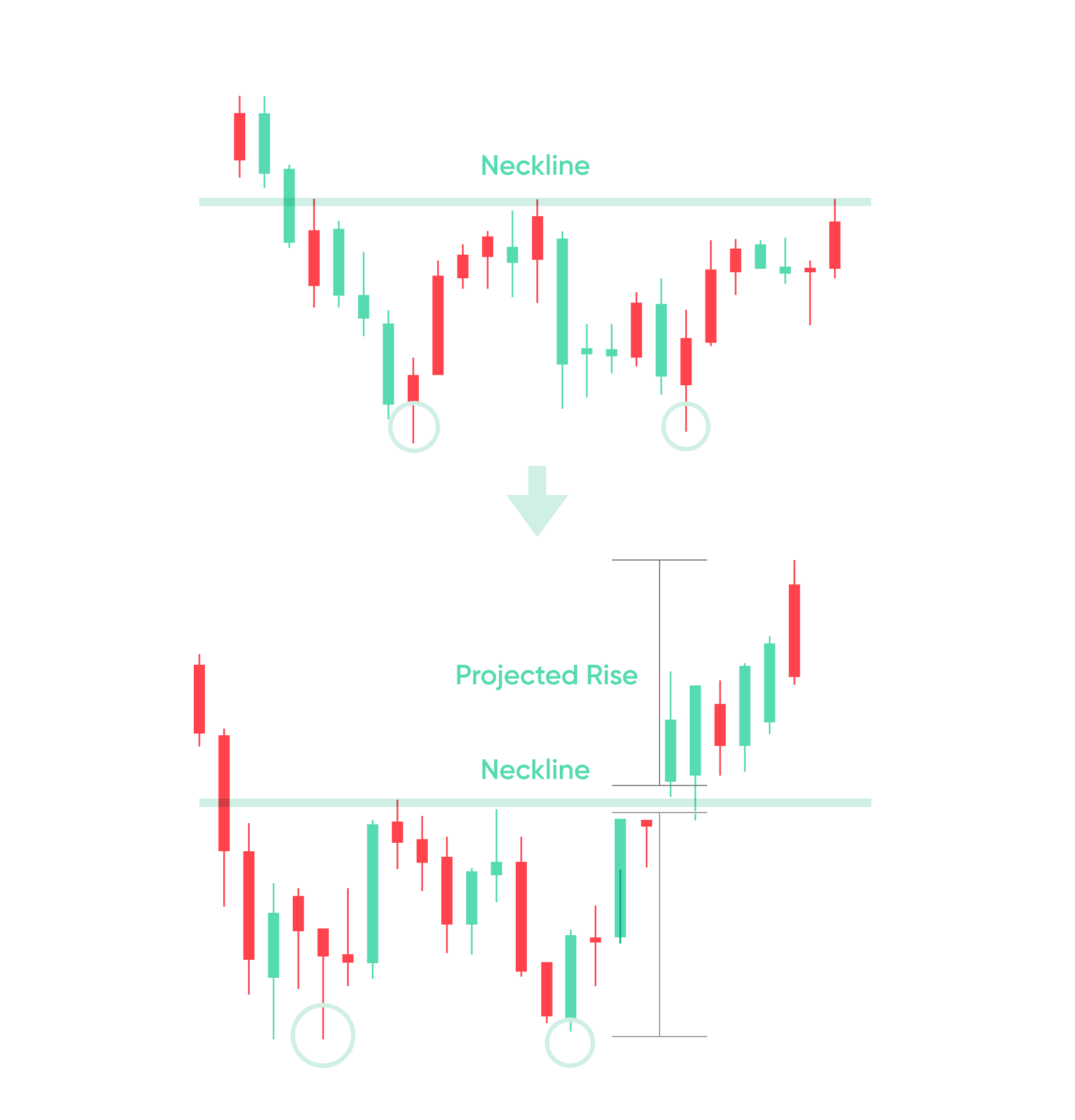
Both patterns point to a potential breakout in the opposite direction to the doubles. So, a double top forecasts a fall in price, while a double bottom forecasts a rise.
The potential breakout duration is assumed to be the inverse of the distance from the neckline to the double top or double bottom. When using double tops or bottoms, don’t jump in too quickly, as they may become a triple top or bottom.
Head and shoulders
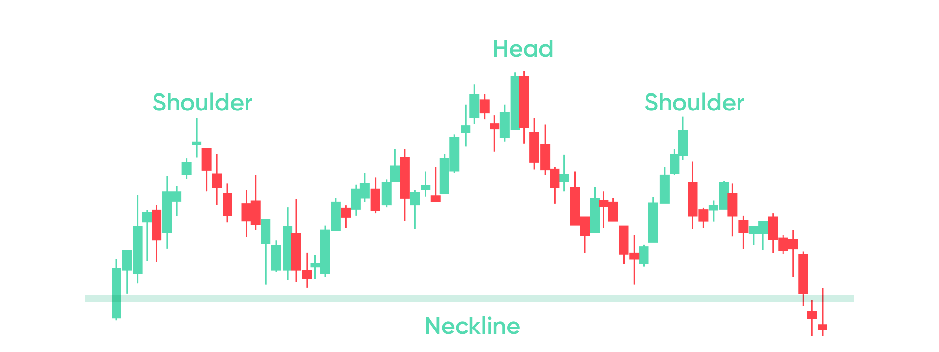
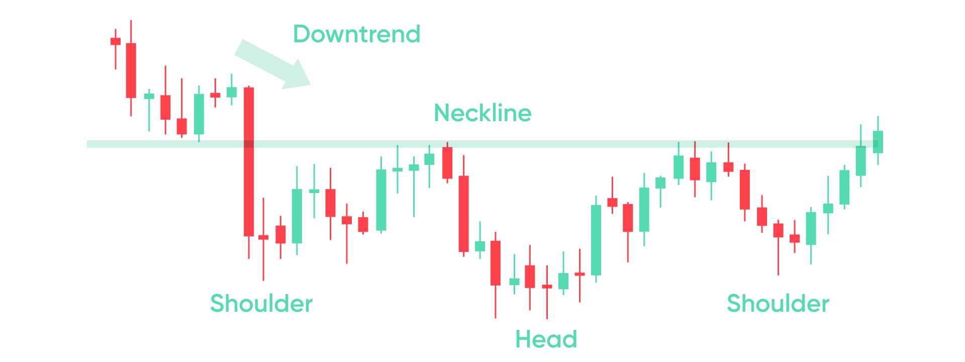
A head and shoulders pattern can be recognized by one high peak, flanked by two lower peaks.
It also has a neckline, but this is between the two drops, on either sides of the main peak or the “head”. It is assumed to forecast a trend reversal.
Like double tops and bottoms, the distance between the neckline and the top of the head, is assumed to be the size of the breakout.
Inverse head and shoulders patterns work similarly, but in the opposite direction.
Both patterns point to a potential breakout in the opposite direction to the doubles. So, a double top forecasts a fall in price, while a double bottom forecasts a rise.
The potential breakout duration is assumed to be the inverse of the distance from the neckline to the double top or double bottom. When using double tops or bottoms, don’t jump in too quickly, as they may become a triple top or bottom.
Triangles
This pattern occurs when prices start moving towards a single point.
Basically, the candlesticks will become shorter, and the deeper peaks and ebbs of the chart will become shallower.
There are various triangles, but we’ll be focusing on ascending, descending, and symmetrical patterns.
Ascending Triangle
An ascending triangle happens when strong resistance creates a horizontal band, as support gradually climbs, creating an upwards angle.
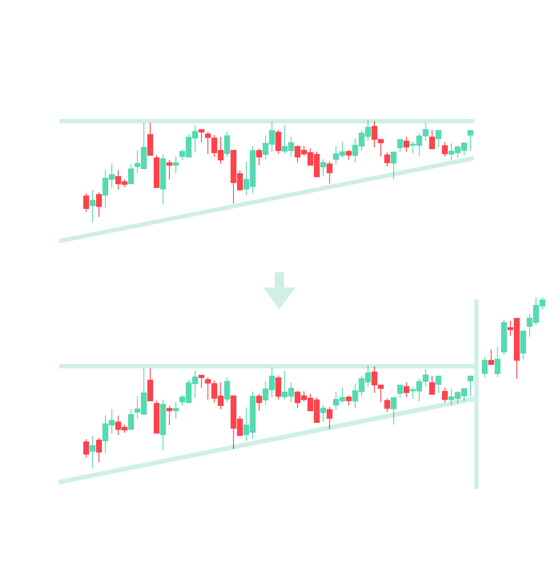
An ascending triangle usually means the price will move upwards, but just like other chart patterns, don’t be too eager to act. In this case prices may continue testing resistance, or even feign a breakout, also called a fakeout.
Descending Triangle
This is the opposite of the previous pattern, where a strong horizontal support line is established, as the resistance level starts pointing downwards.
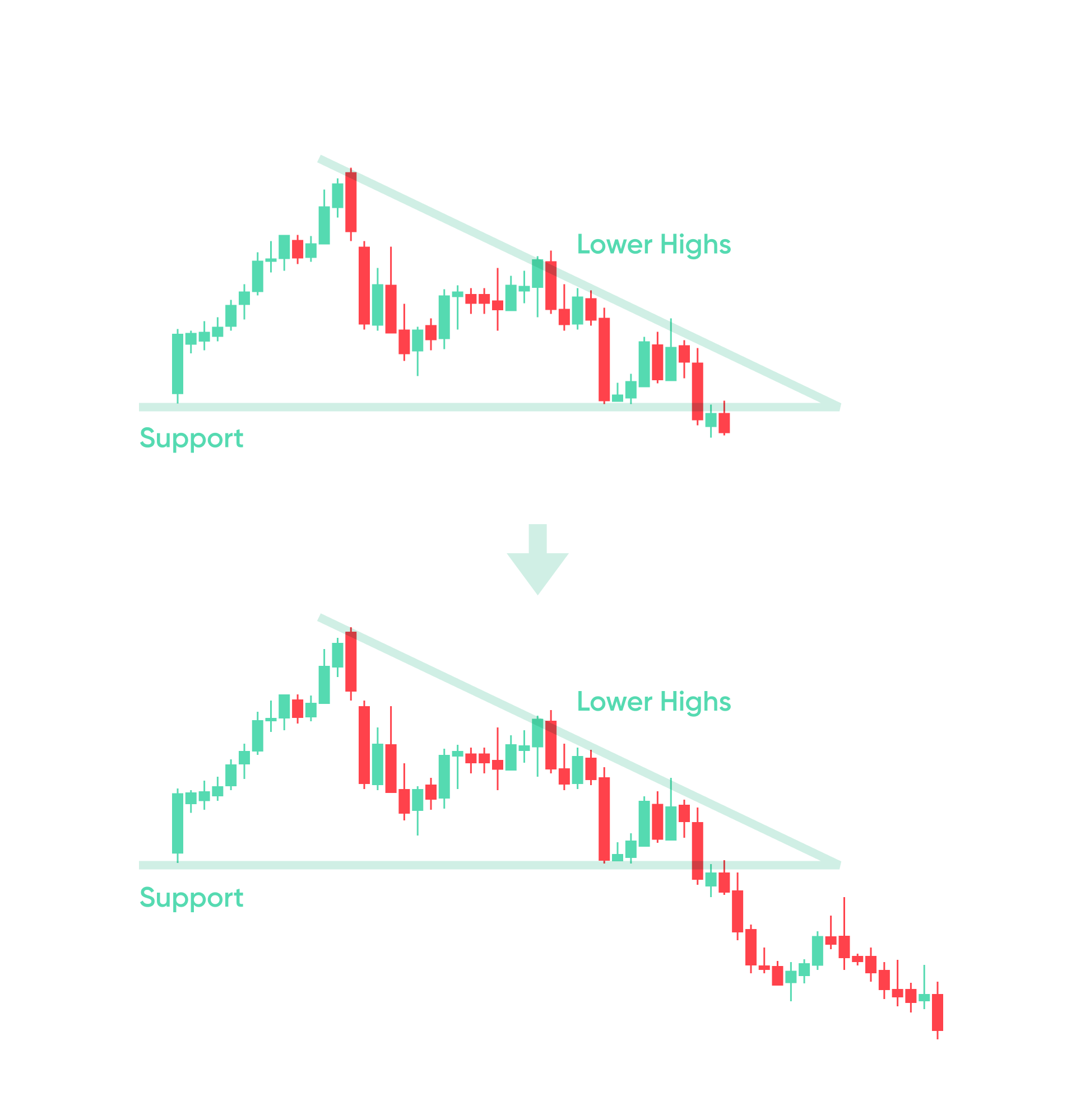
A descending triangle indicates the potential for a downwards breakout.
Symmetrical Triangle
This pattern is created when both support and resistance start converging at the same angle.
Unlike the other two patterns, that can point towards a breakout, the symmetrical triangle implies that the price trend will continue. Of course, for a triangle to be created, this means that there was a small period of price fluctuation.
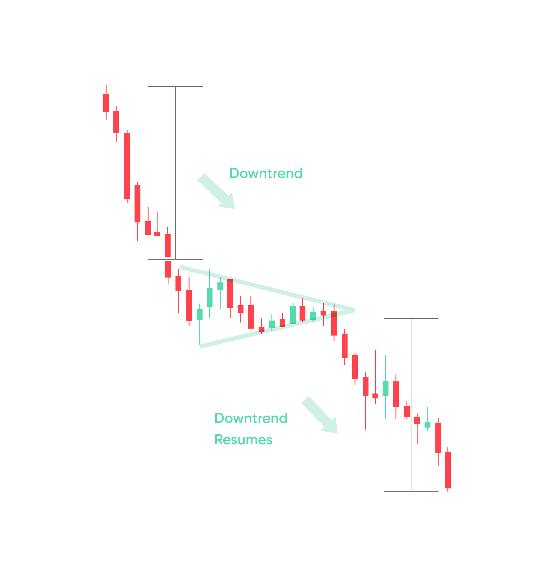
If there’s no obvious trend before the symmetrical triangle, then the price could still break upwards or downwards. In such cases, further analysis may be needed.